First load and clean the data
library(tidyverse)## -- Attaching packages --------------------------------------- tidyverse 1.3.1 --## v ggplot2 3.3.5 v purrr 0.3.4
## v tibble 3.1.6 v dplyr 1.0.7
## v tidyr 1.1.4 v stringr 1.4.0
## v readr 2.1.1 v forcats 0.5.1## -- Conflicts ------------------------------------------ tidyverse_conflicts() --
## x dplyr::filter() masks stats::filter()
## x dplyr::lag() masks stats::lag()source(
here::here("static", "load_and_clean_data.R"),
echo = FALSE
)## Rows: 698351 Columns: 16## -- Column specification --------------------------------------------------------
## Delimiter: ","
## chr (5): data_dte, usg_apt, fg_apt, carrier, type
## dbl (11): Year, Month, usg_apt_id, usg_wac, fg_apt_id, fg_wac, airlineid, ca...##
## i Use `spec()` to retrieve the full column specification for this data.
## i Specify the column types or set `show_col_types = FALSE` to quiet this message.EDA Plots:
The following plot plots the total foreign passengers per year from 1990 to 2022 and also colors them by month in order to see which months are the most popular for foreign travel. It shows that foreign travel increased per year until 2020.
plane_data_clean %>% group_by(Year, Month) %>% summarize(n = sum(Total)) %>% ggplot(aes(Year, n)) + geom_point(aes(color = as.factor(Month))) + labs(y = "Total Passengers")## `summarise()` has grouped output by 'Year'. You can override using the `.groups` argument.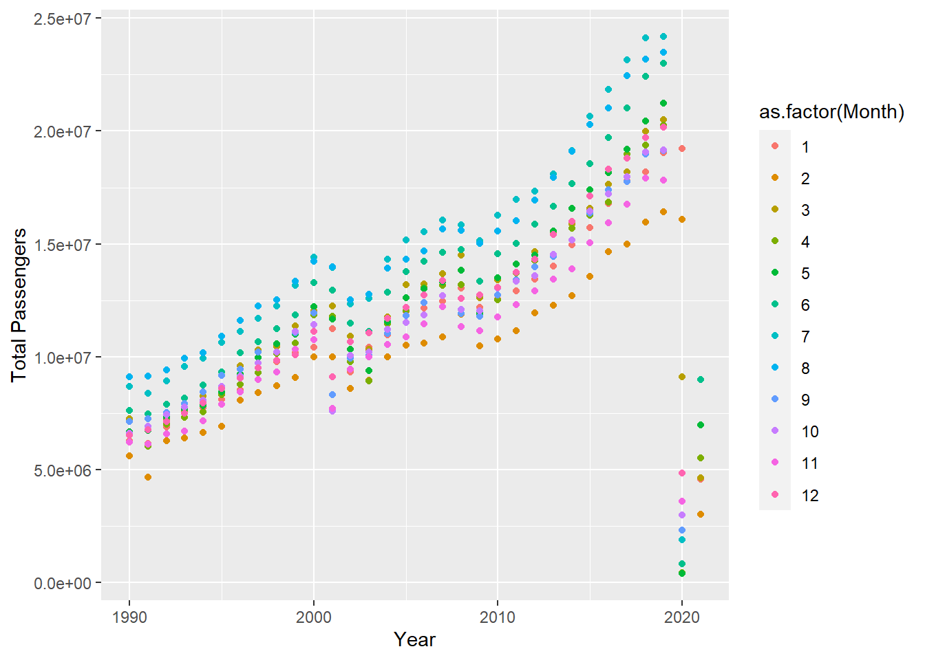
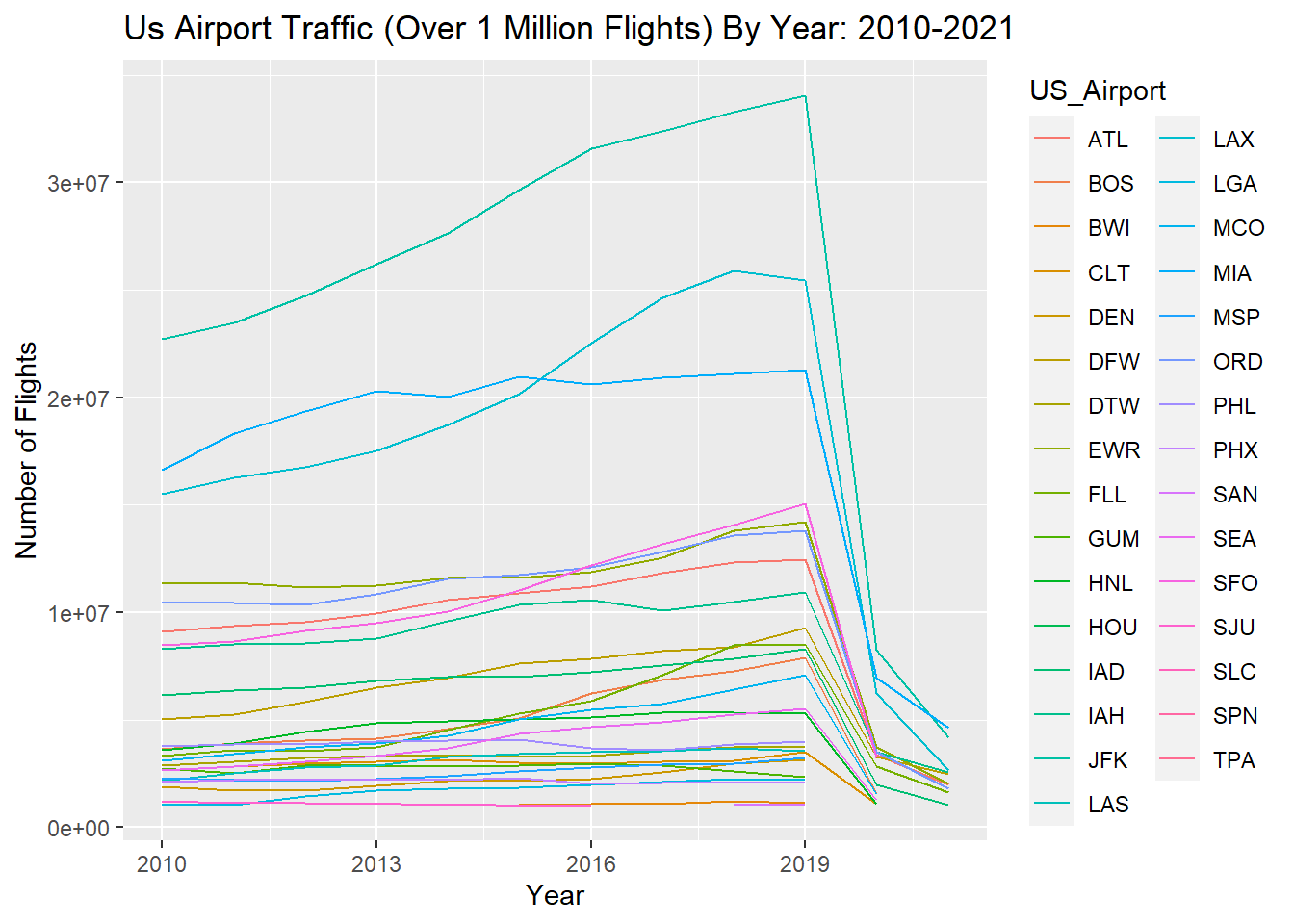
The following plot plots the number of flights per year after 2010 at airports with more than 1 million flights.
plane_data_clean %>%
  group_by(US_Airport, Year) %>%
  summarize(n = sum(Total)) %>%
  arrange(Year, n) %>%
  filter(n >= 1000000) %>%
  filter(Year >= 2010) %>%
  ggplot(aes(Year, n)) +
  geom_line(aes(color = US_Airport)) +
  labs(title = "Us Airport Traffic (Over 1 Million Flights) By Year: 2010-2021") +
  xlab("Year") +
  ylab("Number of Flights")
## `summarise()` has grouped output by 'US_Airport'. You can override using the `.groups` argument.