First load and clean the data
library(tidyverse)
source(
  here::here("static", "load_and_clean_data.R"),
  echo = FALSE
)
For our interactive, we plan to use the joined data that combined the flight data and GDP data for most countries that had US flights from 1990 to 2020. The user would be able search a country to see plots of GDP vs total flight passengers for that country. Certain countries seem to demonstrate a more clear correlation between GDP and total passengers than others.
For example, the plot for the United Kingdom would look like
plane_data_join_GDP %>%
  filter(Year < 2020, FG_wac == 493) %>% group_by(Year) %>% summarize(n = sum(Total), gdp = GDP) %>% unique() %>%          ggplot(aes(gdp, n)) + geom_point()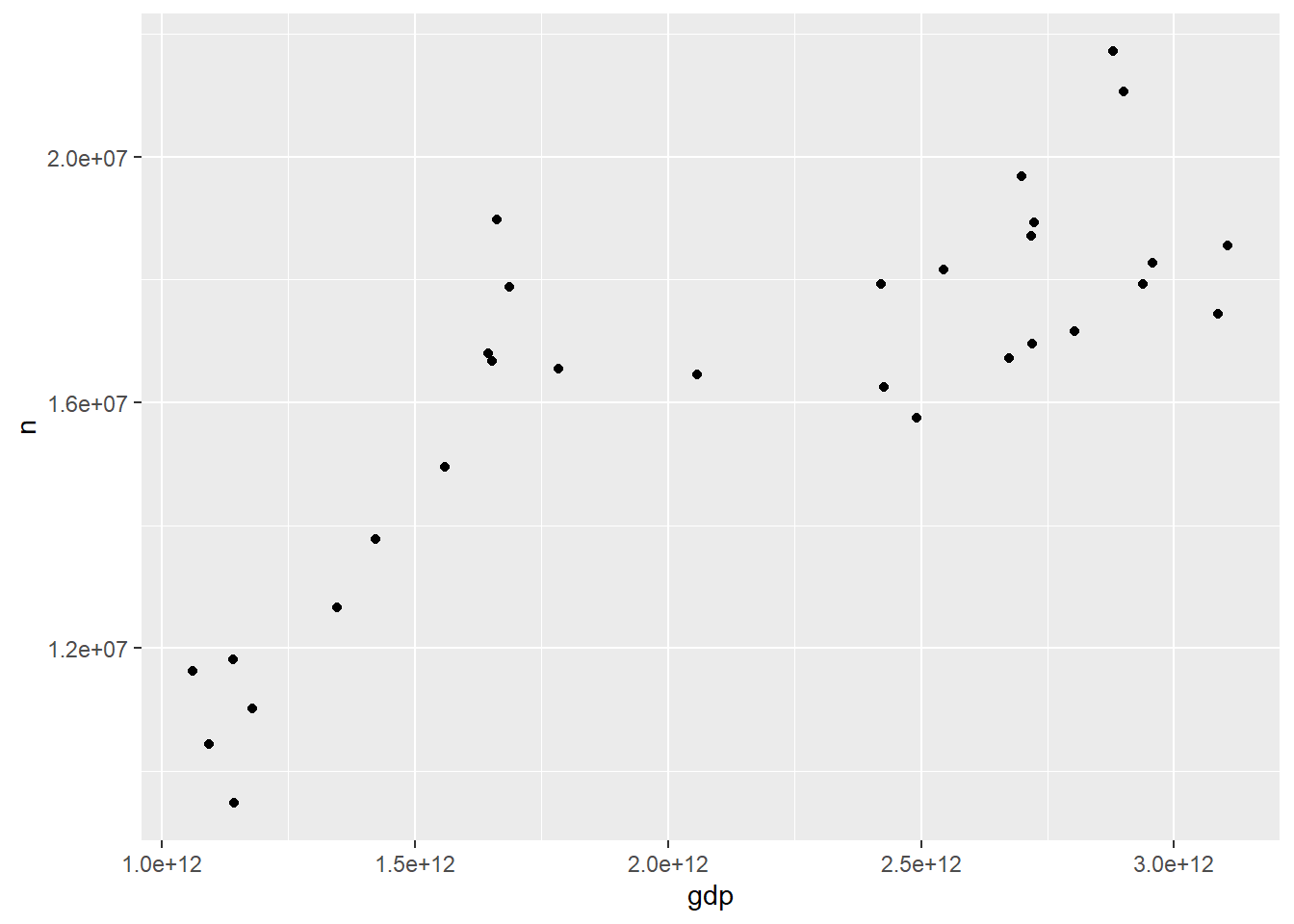
We can also allow the user to filter by continents since the hundreds place corresponds to the continent of that country. For the WAC for Europe is 400-500, Africa is 500-600 and South + East Asia is 700-800.
GDP vs total passengers for Europe:
plane_data_join_GDP %>% filter(Year < 2020, FG_wac >= 400, FG_wac < 500) %>% group_by(Year) %>%
  summarize(n = sum(Total), gdp = GDP) %>% unique() %>% ggplot(aes(gdp, n)) + geom_point()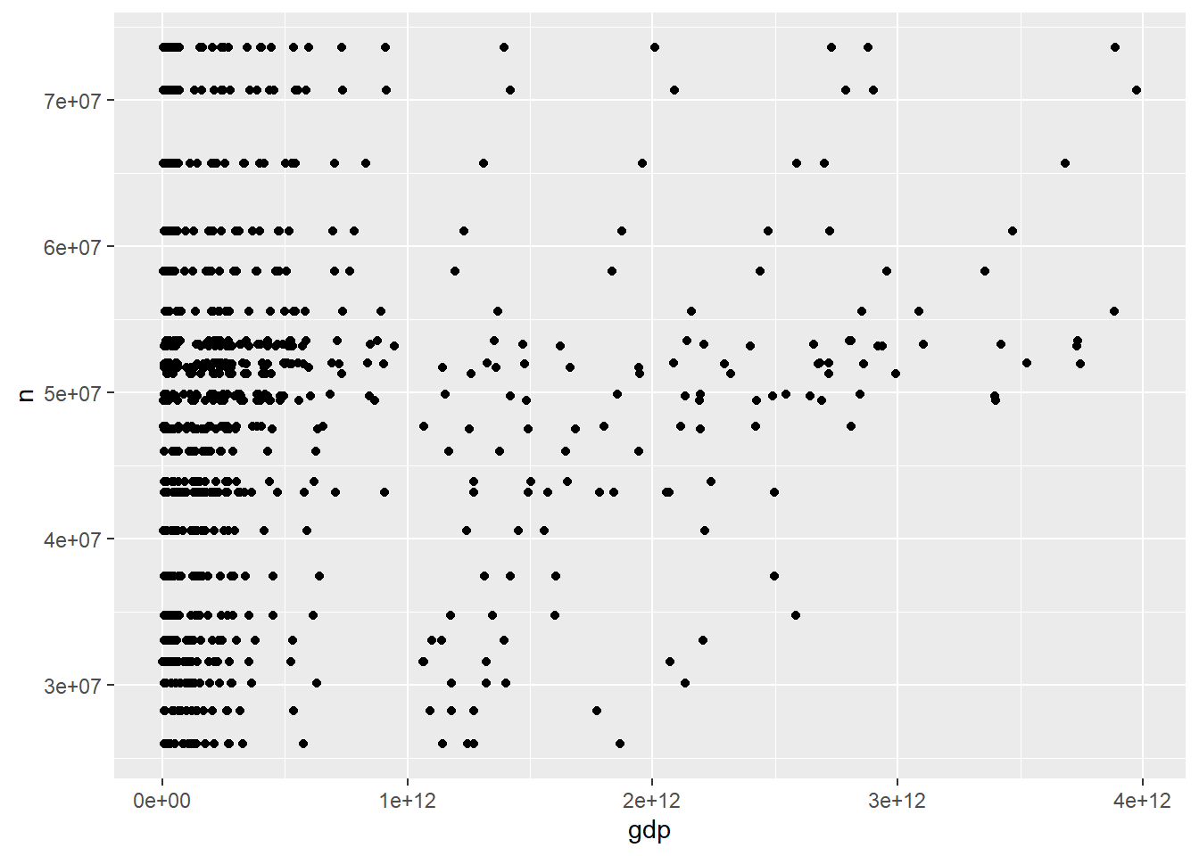
We can also allow the user to zoom in by filtering by higher GDP. For example, for GDP vs total passengers for the whole world:
plane_data_join_GDP %>% filter(Year < 2020) %>% group_by(Year) %>%
  summarize(n = sum(Total), gdp = GDP) %>% unique() %>% ggplot(aes(gdp, n)) + geom_point()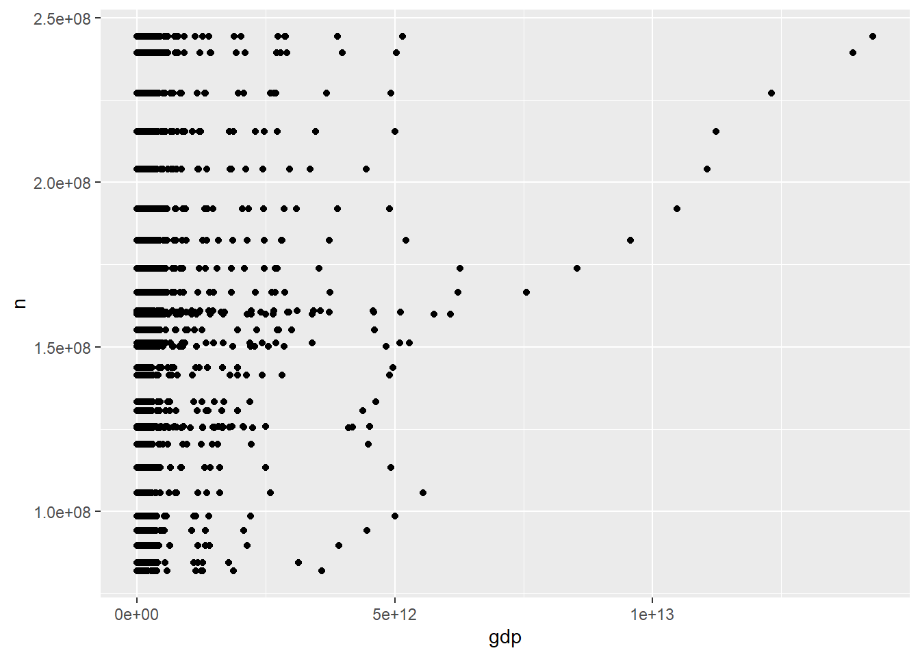
plane_data_join_GDP %>% filter(Year < 2020, GDP > 4e+12) %>% group_by(Year) %>%
summarize(n = sum(Total), gdp = GDP) %>% unique() %>% ggplot(aes(gdp, n)) + geom_point()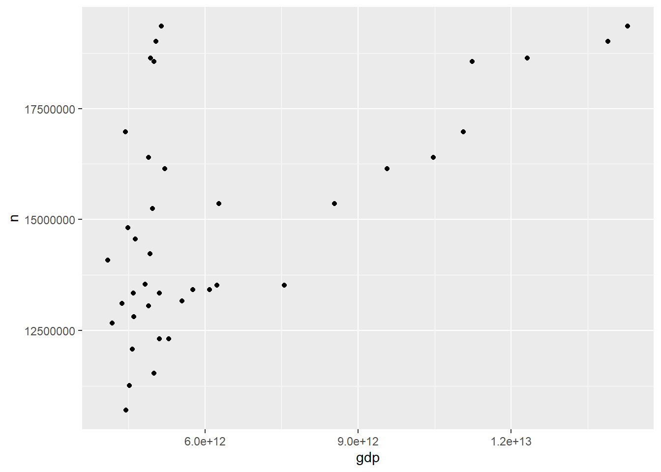 A greater correlation can be seen when the GDP is higher.
We can also allow the user to filter between charter and scheduled flights for a country.
For example, for Brazil, plots for GDP vs total for scheduled and chartered flights seem to show that Scheduled flights have more of a correlation with GDP then charter flights.
plane_data_join_GDP %>%
    filter(Year < 2020, FG_wac == 316) %>% group_by(Year) %>% summarize(n = sum(Scheduled), gdp = GDP) %>%
    unique() %>% ggplot(aes(gdp, n)) + geom_point()
plane_data_join_GDP %>%
    filter(Year < 2020, FG_wac == 316) %>% group_by(Year) %>% summarize(n = sum(Charter), gdp = GDP) %>%
    unique() %>% ggplot(aes(gdp, n)) + geom_point()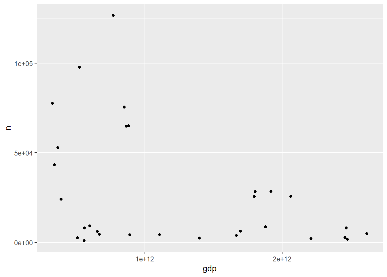
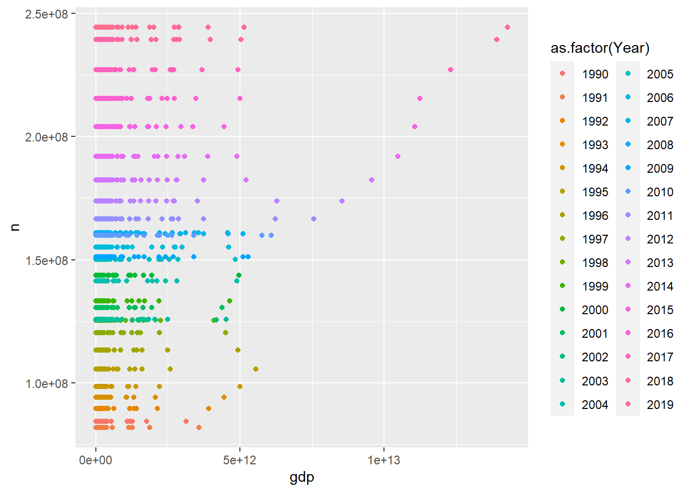
We can also explore the relationship between GDP and Total number of flights throughout the years. The below plot displays datapoints for a GDP and Passenger count of a specific country, so this plot displays the overall relationship between GDP and total passengers colored by the year in which the data was collected. We can see GDPs begin to rise slightly, but usually not as rapid as passenger counts.
plane_data_join_GDP %>%
  filter(Year < 2020) %>%
  group_by(Year) %>%
  summarize(n = sum(Total), gdp = GDP) %>%
  unique() %>%
  ggplot(aes(gdp, n, color = as.factor(Year))) + geom_point()