First load and clean the data
library(tidyverse)
source(
  here::here("static", "load_and_clean_data.R"),
  echo = FALSE
)
We joined GDP growth data per year to the travel data in addition to the previously joined GDP data per year. Take the 10 countries with highest GDP growth in 2019.
high_growth <- plane_data_join_GDP %>% filter(Year == 2019) %>% group_by(Country) %>% transmute(FG_wac, GDPGrowth) %>% arrange(desc(GDPGrowth)) %>% unique() %>% head(10)

(knitr::kable(high_growth))| Country | FG_wac | GDPGrowth |
|---|---|---|
| Ethiopia | 522 | 8.364086 |
| Bangladesh | 703 | 8.152684 |
| Armenia | 405 | 7.600000 |
| Dominica | 221 | 7.571392 |
| Cambodia | 709 | 7.054107 |
| Vietnam | 791 | 7.017435 |
| Marshall Islands | 844 | 6.644664 |
| Ghana | 529 | 6.507775 |
| Philippines | 766 | 6.118526 |
| China | 713 | 5.949714 |
Plot the log(GDP) over total passenger travel data for these 10 countries. Take the log to take into account the large differences between GDP for these countries.
plane_data_join_GDP %>% filter(Year < 2020,FG_wac %in% high_growth$FG_wac) %>% group_by(Year) %>% summarize(TotalPassengers = sum(Total), gdp = log(GDP), Country) %>% unique() %>% ggplot(aes(gdp, TotalPassengers)) + geom_point(aes(color = Country))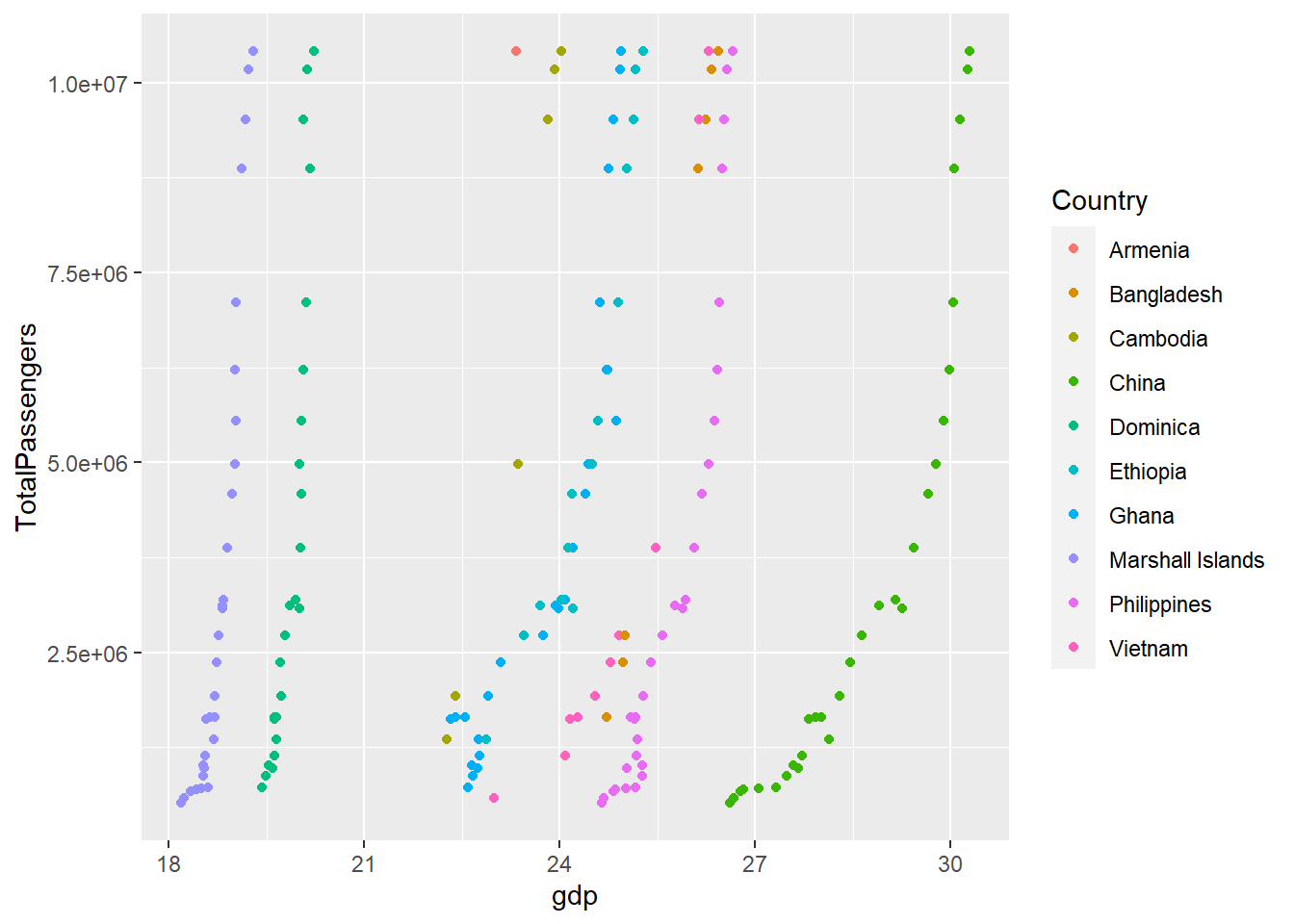
A tentative thesis shown in the plot could be that countries with high GDP growth exhibit more of a correlation between GDP and travel from the US. Possible issues is that US doesn’t necessarily have direct flights to certain countries.