First load and clean the data
library(tidyverse)
source(
here::here("static", "load_and_clean_data.R"),
echo = FALSE
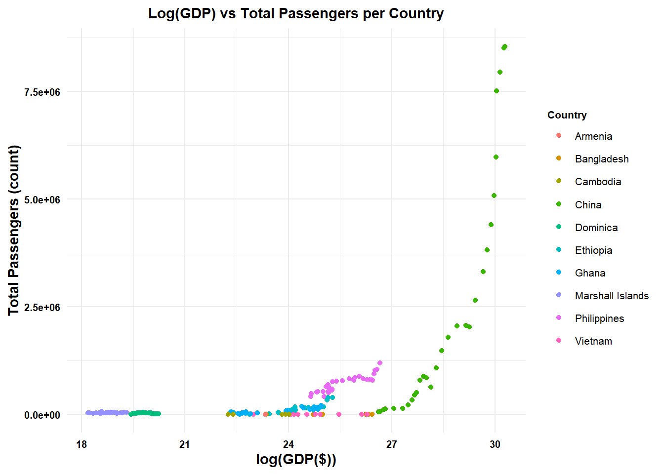
)There are many improvements we hope to make to polish our visualizations. Utilizing ggtheme in the ggpubr package, we hope to change the theme to theme_minimal() as we believe this theme will allow the colored points associated with countries to best be represented, while still maintaining the gridlines to reference the plot points. We can also ensure the y axis labels are properly labeled in scientific notation, utilizing the scale_y_continious() function. We will change the x and y axis labels to be clearer than the labels in our dataset. We will change the x axis to GDP($) and the y axis to Total Passengers(count). Furthermore, we will use the labs_pubr function in ggpubr to improve the formatting of the labels. Finally, we will add a title using the labs function, and center the title by setting the hjust to 0.5.
library(ggpubr)

high_growth <- plane_data_join_GDP %>% filter(Year == 2019) %>% group_by(Country) %>% transmute(FG_wac, GDPGrowth) %>% arrange(desc(GDPGrowth)) %>% unique() %>% head(10)

p1 <- plane_data_join_GDP %>% filter(Year < 2020,FG_wac %in% high_growth$FG_wac) %>% group_by(Year, Country) %>% summarize(TotalPassengers = sum(Total), gdp = log(GDP), Country) %>% unique() %>% ggplot(aes(gdp, TotalPassengers)) + geom_point(aes(color = Country))

p1 + theme_minimal() + scale_y_continuous(labels = function(x) format(x, scientific = TRUE)) + labs_pubr(base_size=11, base_family ="") + labs(x = "log(GDP($))", y = "Total Passengers (count)", title = "Log(GDP) vs Total Passengers per Country") + theme(plot.title = element_text(hjust = 0.5))